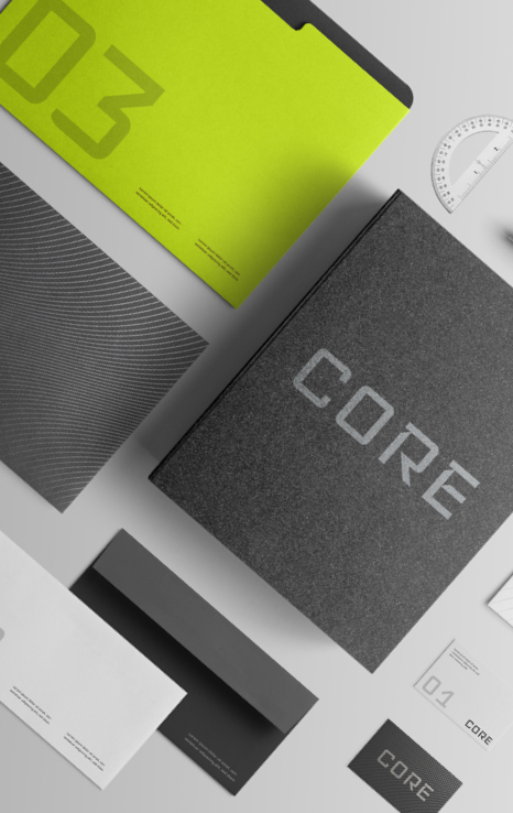
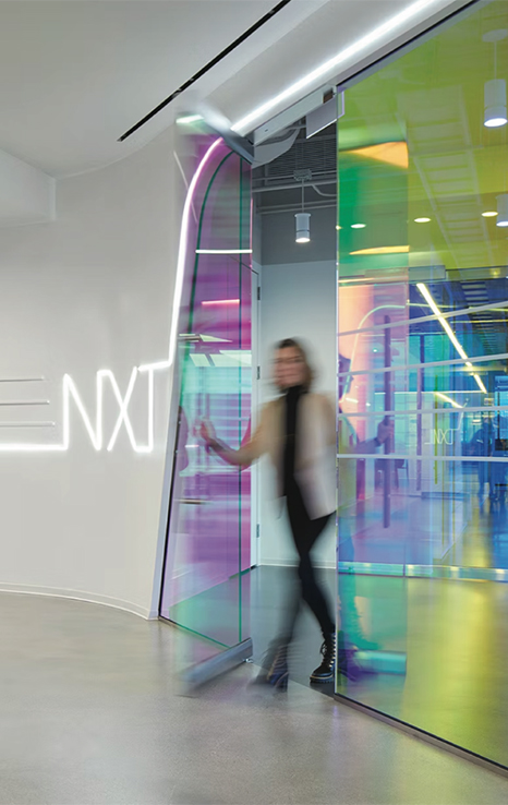
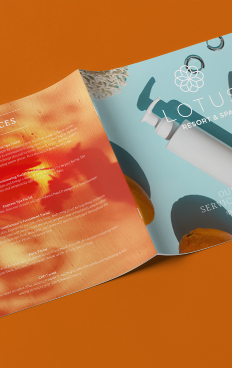
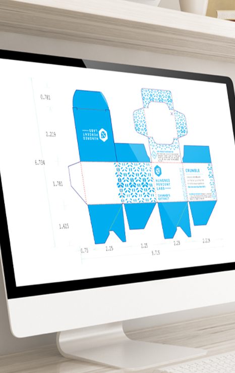
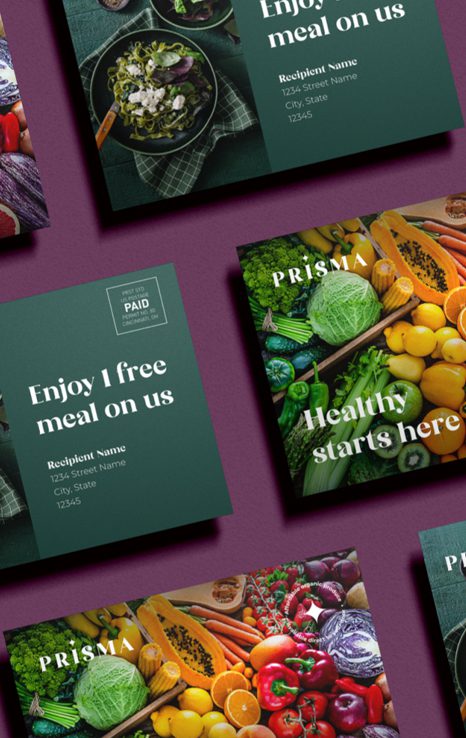
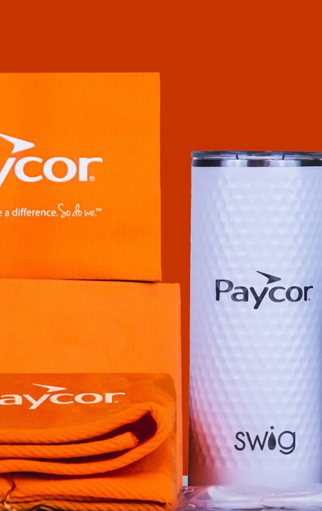
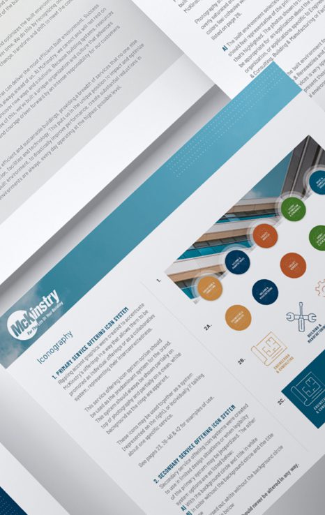
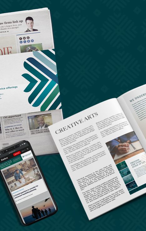
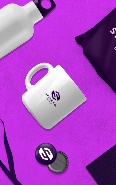
From package design and promotional materials to marketing collateral and experiential graphics, color is an essential component in how audiences engage and react to your designs and branding. The first thing prospects will notice is color (consciously or not). In an instant, color does many things, including:
-
- Grabbing attention.
- Highlighting areas of importance.
- Establishing credibility.
- Denoting aesthetics.
- (When particularly high quality) differentiating you from your competition. If a luxury brand, consider adding print embellishments to accentuate specific messaging or colors.
Used optimally, color is also a powerful way to elicit emotion. For example, red is often associated with excitement and passion, but also danger. Yellow is energetic and cheery, but also agitating. Cool and non-threatening, blue is seen as a sign of reliability, as well as calm and peace. Green is relaxing and symbolizes nature. When specifying color, make sure your color palette is consistent and brand appropriate with the message you wish to convey.
When assigning colors to your design pieces, remember that the color you see on your computer is not representative of what is produced on a printing press. Images on your monitor are displayed using RGB colors, or those produced by combining red, green, and blue. Offset and digital presses produce color by blending cyan, magenta, yellow, and black (CMYK), so unless you have a color management system, the color you see on your monitor may not match exactly what you see in print. If color is critical to your project or brand, make sure to collaborate with your printing representative to achieve the results you need. PDF proofs are convenient, but a hard copy press proof will provide the most accurate results.


